Thumbnail analysis for DIY niche
Jan 07, 2024
Thumbnail
So there is a grid of thumbnails in niche that you can fairly call decent, what you will notice is that they are rather simple, without any excessive captions or fillings. They are just simple aesthetic and they do what they are ought to, answer only so much that the untold will spark enough curiosity to force viewer to check it out. That’s how the thumbnails are ought to be used!
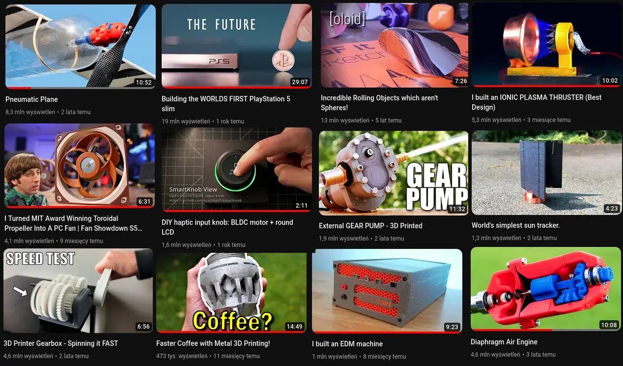
And let’s now analyze some channel, to check how they handle it:
You can see how the videos from the same series diverse in views as hard as ×100 performance of the others. I’m saying it again, that’s the same video series, same topic, editing, quality… and yet one is getting the less than 1% views of the other. That’s proving my saying that “thumbnail + title combo is most important” quite bluntly. You can call it on algorithm error. But it’s not, YouTube algorithm determine itself based on click-trough-ratio if it’s low your video will not be promoted.
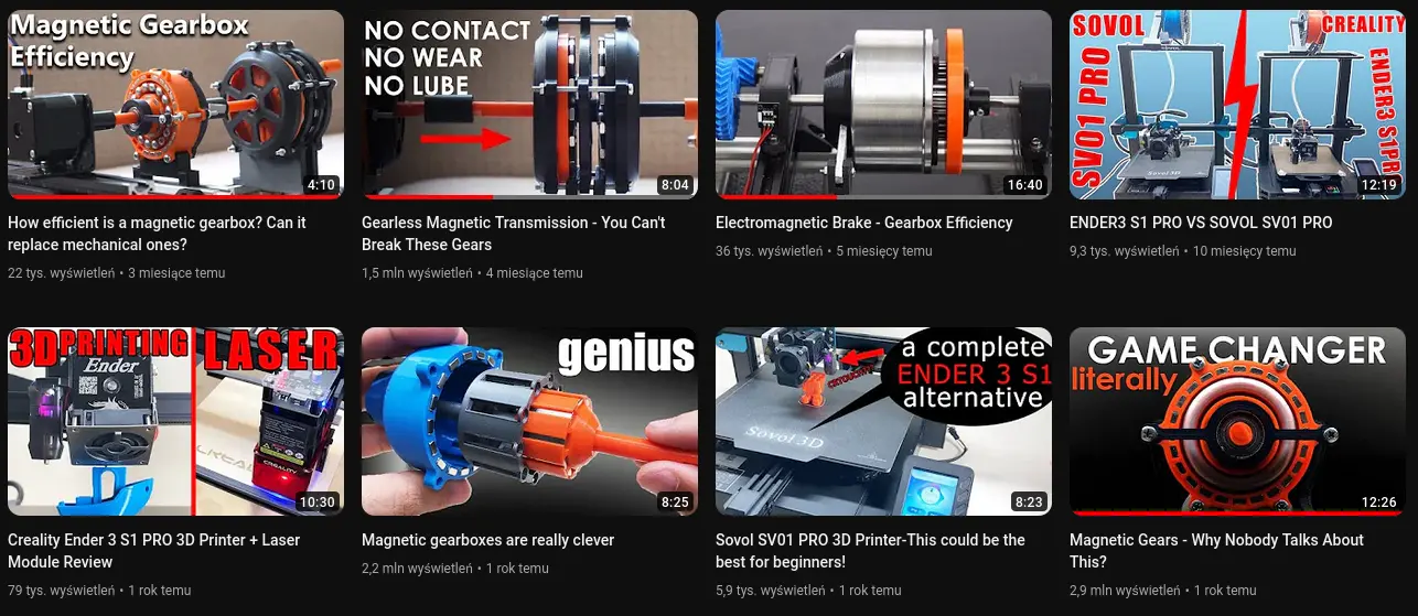
This one not as minimal as I would like to, but it shows strong brand identity, and how recognizable key art can create attachment. I like this ongoing series, whenever I see any of his vid I immediately recognize it.
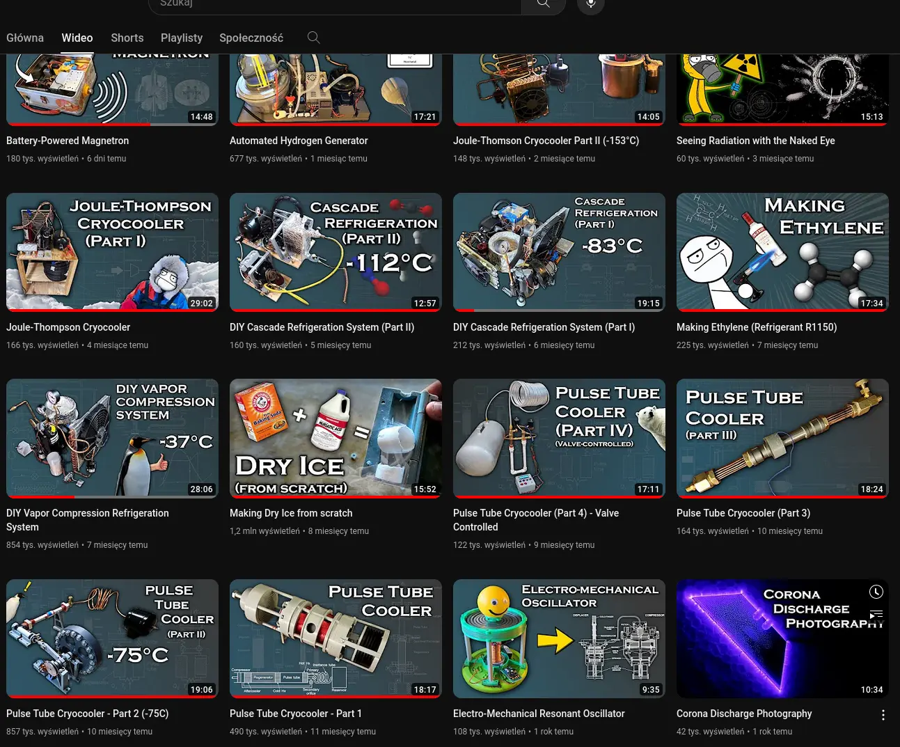
Interesting topic defends itself on its own.
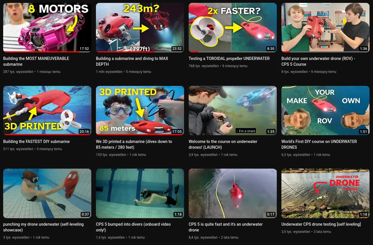
Pick one miniature…

You can spot gems alongside the garbage.
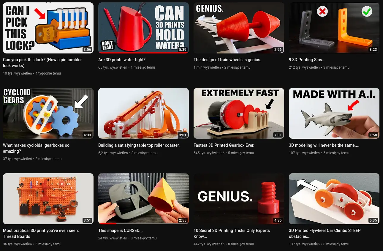
Good brand development using color palette, and giving the brand face.
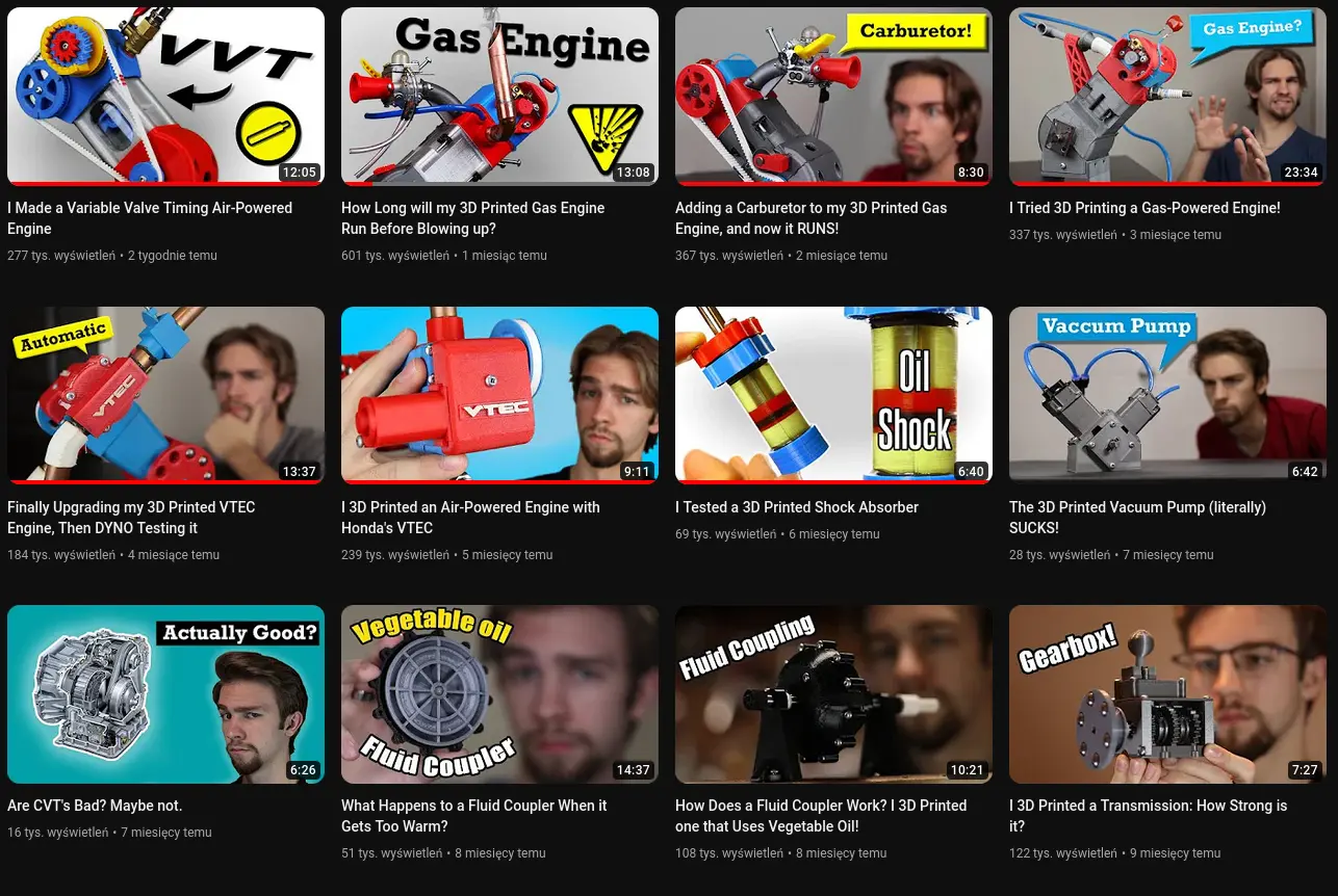
Masterclass of aesthetics.

I don’t know is it fair to call YouTube thumbnails an art, but there is something fascinating about it, the unseen set of rules that determines their success so straight and bluntly. Yet it’s hard to explain theory of it, after analyzing the set I have provided you should be able to start noticing patterns.
Remember that there a not universal and their work only with given video, and the information about that is provided to you be the second most importing thing the tittle. They need to work in perfect synergy.